

Scope
Create a user experience for prospective and existing customers that introduces YouTube TV, including what it is, how it works, and its many benefits.
Show consumers that Frontier Fiber and YouTube TV are better products than Internet and cable TV, especially when they’re combined.
Results
Educate consumers about what YouTube TV is and its advantages, how to use it, and the benefits of bundling it with their Fiber Internet plan.
Enable a seamless experience for both new and existing customers to purchase YouTube TV directly through Frontier, along with any internet plan. Guide users through activation, discount eligibility, and setting up the service on their devices.
Background
Frontier Communications discovered through market research that potential customers are hesitant to switch from cable to fiber internet service because they worry about missing out on local network programming, news, weather, and sports channels.
In response, they has teamed up with Google to provide YouTube TV as its main entertainment streaming service, which includes local channels and sports.
Process
Placing the focus on the user and their needs in each phase of the design process.
I prefer the double-diamond design process model.

Target Audience
Our target audience for this product is our “Peak Performers.“ See the user profile below.
Using data collected from our marketing segmentation, and created user personas.

SOLUTION 1
User Flow
Scenario: A prospective customer shopping for internet service lands on the Frontier.com homepage.
They “check availability,” enter their address, select Fiber 2 Gig and YouTube TV as an add-on, and proceed through the purchase flow.
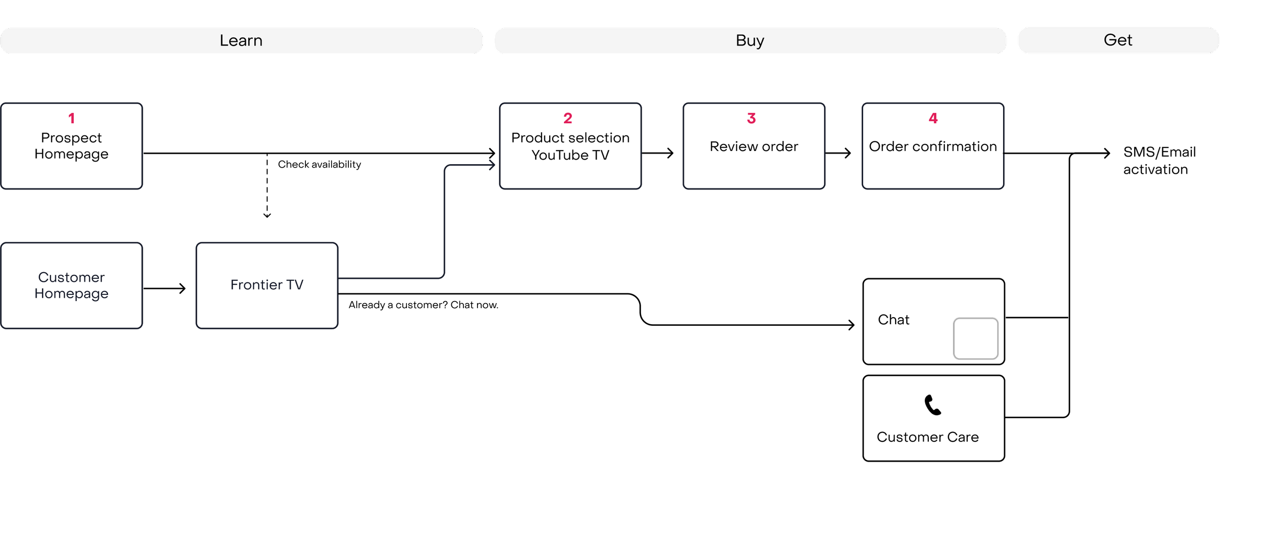
Prospect Homepage > Check availability > 2. Product selection YouTube TV > select add-ons > 3. Contact Information > 4. Order Confirmation
SOLUTION 2
User Flow
Includes the user flow touchpoints from get, fix/change, through to use.
Begins from the email/text sent to the customer, leads to a landing page that prompts the user to log in or create a Google account, discount eligibility is granted prompting the user to accept terms, then a confirmation page that helps get them set up for streaming YouTube TV on their devices.
Starting from the activation page, and then taken through to account set-up.
1. Email /Text 2. Sign-in to your Google account. 3. Agree to terms. 4. Activate. 5. Start watching


Post launch - Research
After the launch of YouTube TV, we realized many people were having trouble activating their YouTube TV accounts.
We interviewed 10 participants from each marketing segments, Settled Simplifiers and Peak Performers.
For more information on our marketing segments, see user personas.
Objective
The purpose of this user research study is to evaluate users' experiences when attempting to sign up for YouTube TV using their Google account, only to find out that the account is not eligible for savings. The goal is to assess users' reactions, navigate through the flow, and gather insights to improve the sign-up process for YouTube TV.
Demographic
Participants: 10. Consumer groups: Settled Simplifiers and Peak Performers
Pre-test questions
1. Have you used any streaming services or subscription-based platforms before? If yes, which ones?
2. Have you ever signed up for a service using your email address? If yes, could you briefly describe your experience?
Scenario
You want to sign up for a special savings offer for YouTube TV using your Google email address. Please go through the sign-up process in the prototype link below and let us know your thoughts. reactions, and any challenges you encounter along the way.
Task
Activate your YouTube TV subscription using your Google account email.
You will not be using any of your personal information for this test.
Post-task questions:
What was your initial reaction when you saw that your email was not eligible for savings?
Which section of the eligibility explanation is difficult to comprehend?
How much time and effort would you be willing to invest to continue exploring an alternative option to get the savings promotion?
What factors would influence your decision to try an alternative option rather than abandoning the sign-up process altogether?
If you encountered an ineligible email, would you be willing to use a different email address to become eligible for the savings? Why or why not?
Are there any additional features or explanations that would encourage you to explore alternative sign-up options?
How do you think it could better inform users about the eligibility criteria for savings to manage expectations effectively?
Was there anything specific that confused or frustrated you during the sign-up process?
Suppose you choose to leave this screen, what would be your subsequent destination for navigation? This destination could be within the website or anywhere on the internet.
Findings

Lack of Transparency in Eligibility Criteria: Users value transparency in understanding why their email addresses are not eligible for special savings. The usability issue here is the absence of clear and detailed information about the eligibility criteria, which leads to confusion and frustration.
Resistance to Creating New Email Accounts: Users dislike the idea of having to create new email accounts to access special savings. This points to a usability issue where the process of creating new email accounts is perceived as an unnecessary and inconvenient step, potentially causing user drop-offs.
Confusing Activation Process: The activation process was a point of confusion for users. This indicates that the activation steps might not be intuitively designed or explained clearly, leading to a usability issue that can result in user frustration and abandonment.
Unclear Eligibility Explanation: The eligibility explanation provided to users was not clear enough. Users were unsure why certain email addresses were not eligible for savings. The usability issue here is the lack of a comprehensive and understandable explanation, which can lead to user uncertainty and dissatisfaction.Lack of Alternative Path Guidance: Users prefer clear explanations and options for alternative paths. The usability issue here is the absence of clear guidance for users who encounter eligibility issues. Without well-defined alternative paths, users may feel lost and uncertain about how to proceed.
Motivation for Alternative Options: Users are motivated to consider alternative options if they are interested in the service and if alternative savings are available. This finding highlights the importance of usability in presenting alternative options effectively and making them enticing to users.

Lack of Clarity in Eligibility Criteria Messages: The user expressed frustration and confusion about the unclear messages related to eligibility for special savings. This lack of clarity led to uncertainty and difficulty in understanding why their email was not eligible.
Importance of Detailed Explanations: The user emphasizes the need for detailed explanations throughout the signup process. They desire clear communication that explains eligibility criteria and reasons for ineligibility to aid their decision-making.
Clear Communication: The user research underscores the significance of clear communication in all aspects of the signup process. Users want straightforward instructions and information that are easy to understand.
Willingness to Explore Alternative Options: Users are willing to invest time in exploring alternative options for savings, especially when the offered savings are substantial. This highlights the importance of presenting compelling benefits to encourage users to explore further.Thoughtful Approach to Understanding Eligibility: Users take a thoughtful approach to understanding eligibility criteria. They want clear information to guide their decision-making and are unsatisfied with vague or cryptic messages.
Consideration of Experience with Streaming Services: The user's experience with various streaming services influences their expectations and interactions with the signup process. Due to their familiarity with other platforms, a seamless and secure experience is preferred.
Scope
Both the YouTube TV activation and order confirmation pages need to be redesigned. Simplify the instructions for the user by providing an easy step-by-step tutorial, and possibly add imagery to show them.
Results
Compared to the previous page designs, YouTube TV customer account activations on the first date of sale increased by 15%. Intern lowering customer churn and greatly improving the user experience.
Activation Page
Hypothesis: If we remove marketing messaging and focus on the activation process, we’ll reduce confusion.
Goals: Make it easier for customers to understand activation and the steps to follow. Reduce call volume.

TEST 2
Confirmation page
Hypothesis: If we place the device set up as the focal point of the page and make it part of the activation process with clear CTAs, we’ll reduce friction for customers and reduce customer service calls.
Goals: Make it easier for customers to self-serve when setting up their devices.

Retrospective
Break down complex interfaces into simple, guided steps. Use clear language and supportive visuals to show users what to expect next. Avoid relying on vague or abstract icons; instead, provide intuitive cues that make interactions easy to understand and follow.