

Component Library
Scope
Led the 9-month integration of FYBR’s 42 components into product architecture, overseeing requirements and QA of Storybook to align design and development.
Results
Focusing developer resources on building reusable components empowered content editors to reduce page creation time by 96%—from 3 days to 30 minutes—driving efficiency, consistency, and scalability across the platform.
Process
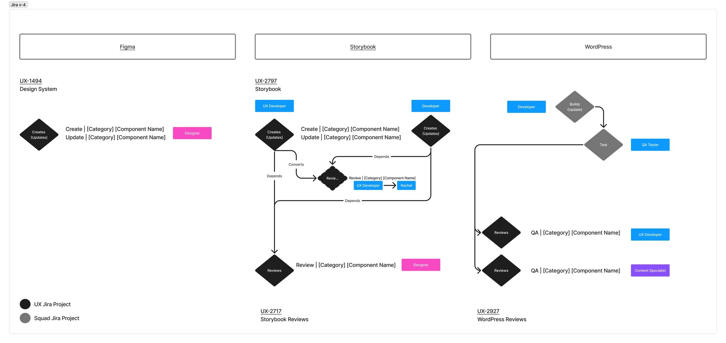
Engaging cross-functional teams and involving multiple team members required a well-defined, seamless process to ensure satisfactory output.
Design in Figma (UX Designer) → Code in Storybook (Front-end Dev) → Build in WP (Backend Dev)
FYBR Design System
Comprised of 42 components, constructed from smaller UI patterns, foundations, base elements, and components.
The fewer components, the better. Flexibility is built into nested base elements.
Foundations
Body copy, Buttons, Headlines, Icons, Inputs, Logos, Tooltips, Typography


Base elements
Button-groups, Forms, Lines, Lists, Tabs, Textblock, Titleblock, Pricing lockups
Components
Alerts, Banners, Badges, Breadcrumbs, Charts, Colorblocks, Faqs, Form, Global Navigation, Heros, Imageblocks, Modals, Newsletter, Plan Cards, Rich Text, Textblock Cards, Testimonials, Titleblocks
SOLUTION 1
Design in Figma
Components are first added to the FYBR Design System. Example shown below of the Hero component.

Code in Storybook
Storybook is an open-source tool for building, developing, and testing UI components in isolation.
It provides a dedicated environment where designers and developers can create, preview, and document component controls.
SOLUTION 2
Build in WordPress
Partnered with product owners to incorporate component documentation into the requirements for each component, and built the components into the CMS WordPress with the functionality we needed. Once the components were built, content editors were then able to add the components to the page, reducing page creation time by 96%—from 3 days to 30 minutes
SOLUTION 3
