

UX/UI Case Study
Shop Internet
A responsive internet shopping experience that assists shoppers in selecting an internet plan
Company: Frontier | Date: Summer 2022
Scope: Redesign the shop Frontier user experience
Tools: Figma, User Testing, Jira
Role: Sr. Product Designer, usability researcher
Team: Agile, Self Directed, CX feedback
Challenge
Redesign the existing shop experience to replace GetFrontier.com. Data revealed the existing shop experience had a large fallout rate into the purchase flow. The flow consists of a landing page that requires a service availability check then directs to a product page showcasing three internet plans to choose from.
Process
It was User-centered design (UCD) process. Places focuses on the users and their needs in each phase of the design process. In the process I involved the users throughout with variety of research and design techniques, so that I can make a really useful and usable product for them.

Product Solution
See video reel below.
Empathize
Understand the user you are designing for.
User Testing
During the primary research phase, I conducted and observed 15 unmoderated remote usability tests. The main objective was to understand the user’s pain points and gain insights from interactions. I then created a highlight reel below capturing the key insights from my observations.
Observations
After watching the unmoderated user tests above. I gathered my findings that I referred to often to help me improve the design (listed below).

DEFINE
Define everything about the user.
Demographics
Demographic data captured by Quantcast collected from visitors on Frontier.com

User Persona
Using the collected data from the targeted users, I created a user persona to understand their primary needs & challenges. This helped me to create unique design solutions for the benefit of the users. I began creating user personas see all personas created for Frontier Communications as part of the define phase for the purchase flow project.
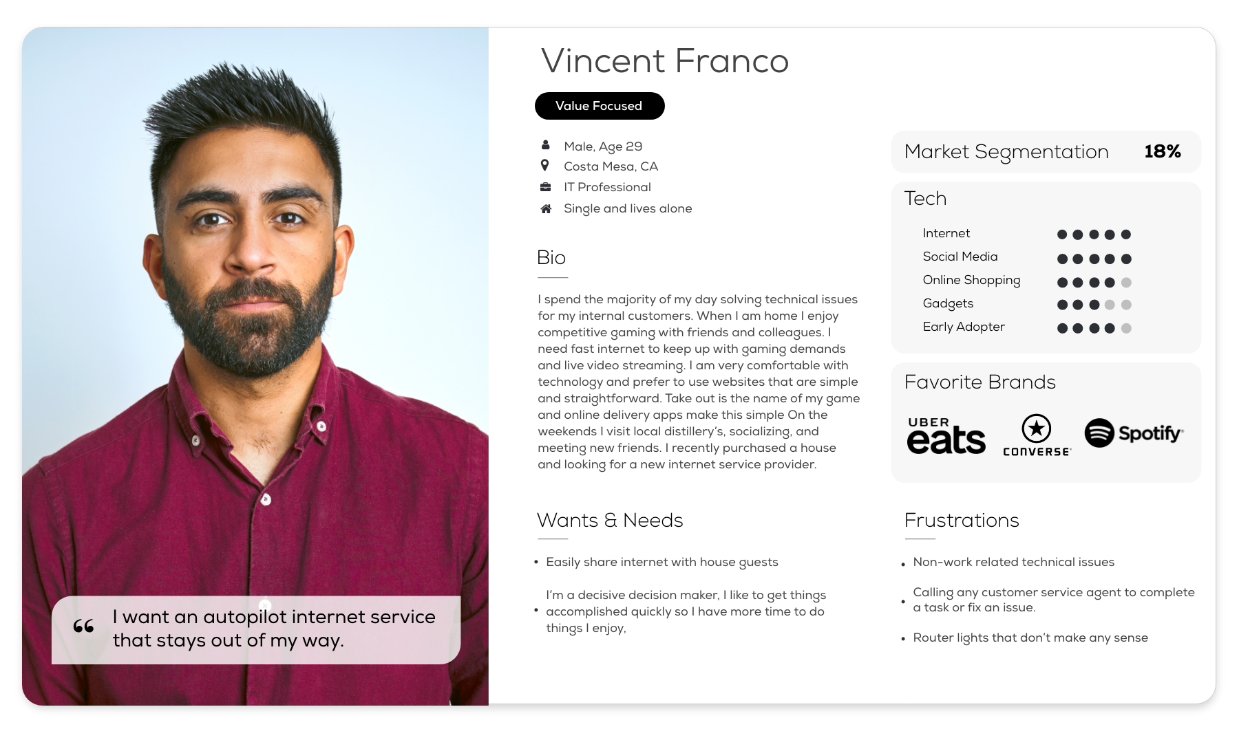
I developed Vince Franco, my main persona in this use case. He is an IT professional residing in Costa Mesa, California. His favorite brands set his expectations in an interactive application. During our research phase we were sure to look at those UX before designing. His wants/needs and frustrations are also key indicators of what the Frontier shop experience must accomplish in order to be a success. See a larger version of Vincent’s persona.

Empathy Map
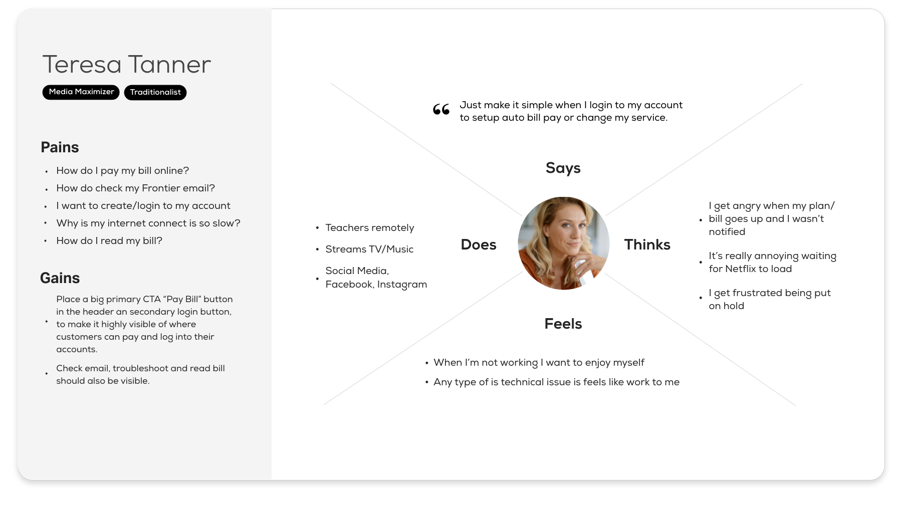
Based on our persona, this empathy map takes a deeper dive into understanding Vincent. Six quadrants provide insight into who he is. This data came from interviews and observations. They sum up how the user feels, thinks, hears, etc. It’s all about what matters too Vincent. Knowing his struggles and victories helped me to find ways for him to achieve his goal and remove or minimize any barriers to it. See a larger version of the empathy map.

User Journey Map
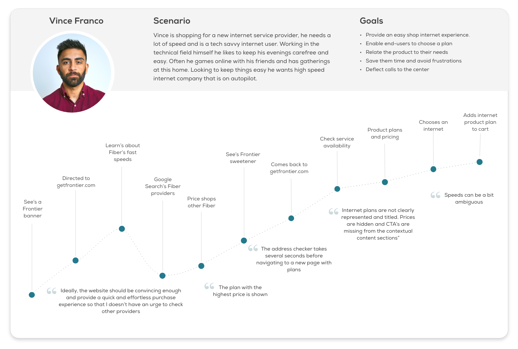
User Journey map to visually demonstrate the user flow from Vince’s perspective. Outlining all the interactions that he encountered from start to finish of his journey shopping for an internet plan
See a larger version of the user journey map.

Project Goals
In Define phase, I take the data gathered from Empathize phase, generate knowledge out of data, and prioritize insights that allow me to target specific problems. Listing project goals can help me form a clear overview of the product, pave ways for determining product features, and make the proper decisions.
I summarized user goals from my user persona and empathy map, collected business goals from the project brief, took technical goals into consideration and visualized the project goals.

Ideate
Come up with creative solutions.
UX Best Practices
After we identified user’s pain points discovered in the research phase. We found examples of popular brands that the users’ are likely to interactive with setting the bar high in the users’ expectation of interaction design.
-

Address Input
Zillow.com has a single input field for address input, easy simple and user friendly
-

Desktop Address Input
Hippo.com prospect homepage desktop viewport, CTA animates in capturing the home address all in one field.
-

Mobile Main CTA
Hippo.com prospect homepage mobile viewport, CTA stays sticky at the bottom.
-

Mobile Main CTA
Lemonade.com uses a cleaver UX on the it’s mobile main CTA. As you scroll down the button animates into the top of the header so it is always in site.
-

Banner Imagery
Hulu.com showcases interesting eye catching image fade and darkened tint over image with a single call to action
-

Plan Chart
Hulu.com plan comparison chart, mobile optimized, easy to compare, highlights most popular
-

Plan Chart
Netflix.com plan comparison chart, is simple and user friendly
Card Sorting
Using Miro board the agile sales team squad had an ideate sesson where we brainstormed ideas. I grouped the cards in similar cards to avoid duplication and arranged into alike groups.

Design
Build solutions.
User Flow
Outline of the successful and failure user path of the shop internet prospect user flow.

Wireframes
Entry Point to Frontier purchase flow. The user lands on the Fiber marketing landing page (left) and checks availability. Once the serviceability check is run and confirmed product plans are shown (right), add to cart is selected prospect advances into the purchase flow.

High-Fidelity Designs
Step 1/2 in shop internet flow. Landing page and entry point to Frontier purchase flow.

Step 2/2 in shop internet flow product page is displayed (after address input and serviceability is confirmed).

TEST
Return to the users to test. Learn fast.
User Testing
Before and after view of product page. Here are some key changes influenced by user and preference testing feedback.


